
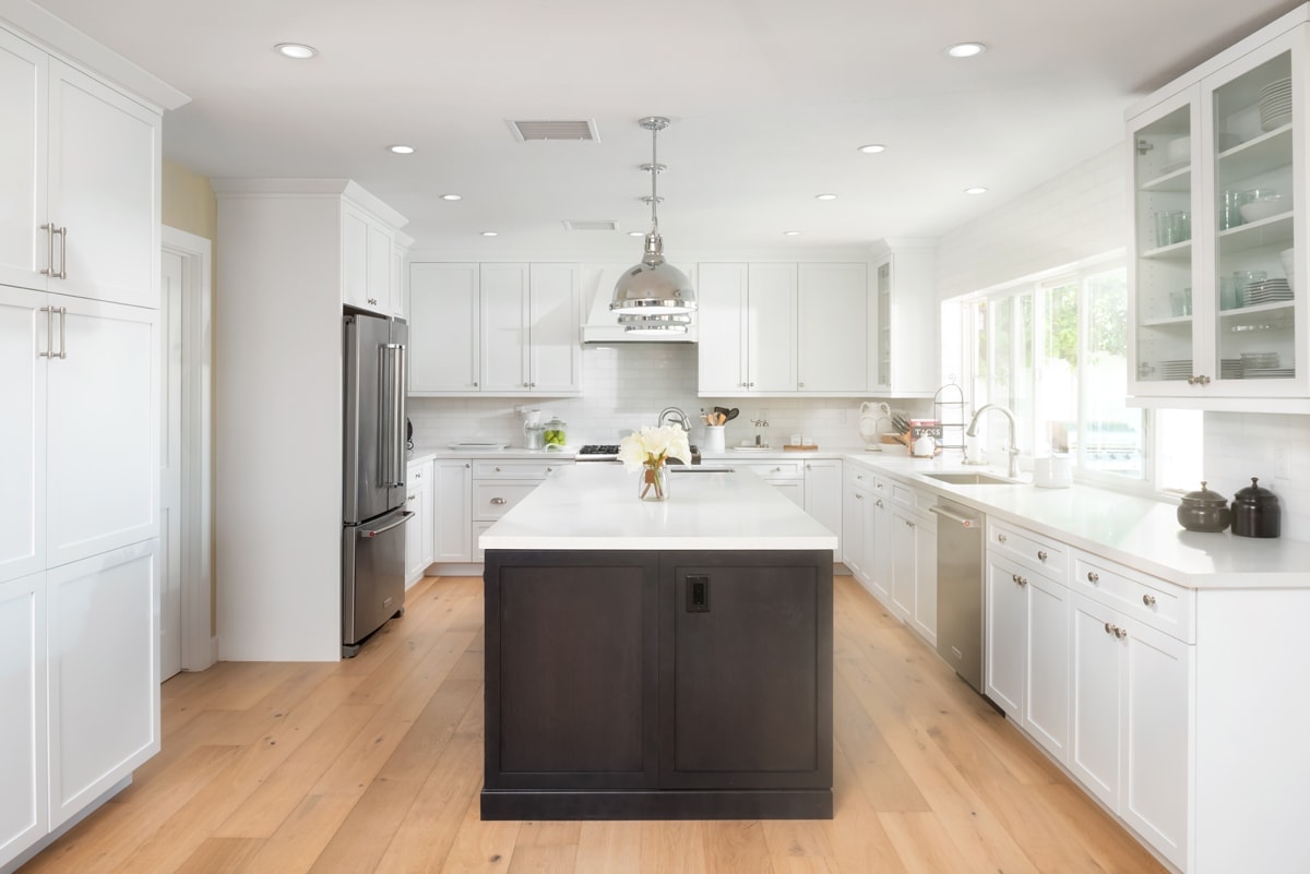
Why Denver Kitchens Follows Their Own Color Rules
Color trends don’t happen in a vacuum—especially not in Denver. Our high-altitude light, more than 300 days of sunshine a year, dramatic seasonal shifts, and eclectic mix of architectural styles (from Wash Park bungalows to new-build modern farmhouses) all shape what looks right in a Mile High kitchen. After hundreds of projects, top cabinet painters in Denver consistently recommend hues that balance brightness, warmth, and longevity. If you’re planning a refresh, consider this your field guide: the shades that actually work here, why they work, and how to get them looking flawless on real-life cabinets.
The Mile-High Effect: How Denver’s Light Changes Color
Before we dive into specific hues, it helps to understand why colors behave differently in Denver:
- Intense sunlight & UV – At higher elevations, stronger UV can fade certain pigments over time. Painters who know Denver choose UV-resilient paint systems and suggest durable sheens.
- Cooler natural light – Even on bright days, our sunlight can read cooler, especially in winter. Colors with slightly warm undertones tend to look truer and more welcoming year-round.
- Dry climate – Denver’s arid air helps paint cure cleanly but can accentuate surface imperfections. Proper prep and the right primer are essential for glass-smooth cabinet doors.
- Mixed architecture – From historic to contemporary, the best color choices are versatile: neutral enough to complement varied materials, but rich enough to add character.
Top Five Trending Palettes (and Why Denver Loves Them)
1) Warm Whites That Don’t Go Yellow
Best for: Small kitchens, low natural light, resale value
Why it works: Warm whites brighten short winter days yet avoid the stark, clinical feel some cool whites can bring at altitude.
Undertone tip: Look for creamy whites with a touch of beige or greige—just enough to soften, not enough to yellow.
Pairing ideas
- Hardware: Brushed nickel or champagne bronze
- Walls: Soft greige or pale oat
- Counters/backsplash: White quartz, zellige, or honed marble-look porcelain
2) Smoky Greiges & Mushroom Neutrals
Best for: Open concept spaces, modern craftsman, mid-mod
Why it works: Greige bridges the gap between warm and cool. Mushroom tones feel organic—fantastic with oak floors, black windows, and stone.
Undertone tip: Greiges with subtle green or taupe undertones won’t fight Denver’s cooler light.
Pairing ideas
- Hardware: Matte black or antique brass
- Walls: Muted linen or stone
- Counters: Veined quartz, soapstone-look surfaces
- Accent color: Deep forest green island
3) Heritage Greens (Sage, Eucalyptus, Deep Forest)
Best for: Homes near parks or with mountain views, nature-forward interiors
Why it works: Green connects indoor spaces with Colorado’s landscape. Lighter shades read calming; deeper greens add luxe sophistication.
Undertone tip: Avoid overly minty or blue-leaning greens if your kitchen gets cold northern light.
Pairing ideas
- Hardware: Aged brass or warm pewter
- Walls: Creamy white or pale mushroom
- Counters: Warm marble-look quartz, butcher block on the island
4) Dusty Blues & Blue-Black Accents
Best for: Transitional and coastal-mountain styles
Why it works: Dusty, desaturated blues feel refined rather than nautical. Blue-blacks on an island or base run give crisp contrast without harshness.
Undertone tip: A whisper of gray keeps blues from turning childlike or too vivid in strong sun.
Pairing ideas
- Hardware: Polished nickel, pewter
- Walls: Warm white
- Counters: Light veined quartz; consider vertical zellige backsplash for texture
5) Charcoal, Ink, and Espresso for Depth
Best for: High ceilings, large kitchens, statement islands
Why it works: Deep neutrals ground expansive spaces and spotlight wood beams, stone, or warm lighting.
Finish tip: A satin or matte urethane-enriched enamel keeps dark tones elegant and fingerprint-resilient.
Pairing ideas
- Hardware: Mixed metals (black + brass)
- Walls: Soft white or pale greige
- Counters: Light stone for contrast; walnut stools for warmth
The Two-Tone Cabinet Trend (Denver Edition)
Two-tone cabinetry isn’t just a Pinterest fad—it’s a practical design for real kitchens. In Denver homes, pros often recommend:
- Light uppers + deeper lowers: Warm white uppers lift the eye, while mid- to deep-tone base cabinets hide scuffs from ski boots, pet traffic, and life.
- Statement island: Choose a saturated color (forest green, ink blue, or mushroom) for the island to anchor the room.
- Perimeter neutral + wood accent: Painted perimeters with a natural white oak island bring Rocky Mountain warmth.
Rule of thirds: Keep 60–70% of cabinetry in a quiet neutral, 20–30% in a statement color, and leave 10% for accents (open shelves, glass fronts, or a range hood).
Finish and Sheen Choices the Pros Rely On
Why sheen matters: Sheen affects color perception, durability, and cleanability.
- Matte/Satin: Today’s favorite for a furniture-grade look. Hides light surface texture better than semi-gloss and reads upscale.
- Low Gloss/Semi-Gloss: Classic, highly washable, slightly more reflective—great for deeper colors if you want a bit of life.
- Conversion-grade enamel or cabinet-specific urethane: In pro workflows, these deliver superior leveling, hardness, and stain resistance.
Denver-specific tip: Ask for a UV-stable, non-yellowing topcoat—especially over whites and lighter neutrals.
Undertones 101: How Pros Avoid Surprise Hues
Under Denver’s bright light, undertones jump out. Top cabinet painters in Denver always check for harmony among:
- Floors: Red oak can make beige paint read pink. White oak loves greige and mushroom.
- Counters: Carrara veining often pulls blue-gray; Calacatta veining leans warm.
- Backsplash: Handmade tiles add shadow variation—test colors against the darkest tile shade.
- Lighting: 2700K bulbs have warm colors; 4000K bulbs are cooler. Decide on bulbs before finalizing paint.
Swatch strategy:
- Order large-format samples or have your painter spray sample doors.
- View morning, midday, and evening.
- Place swatches vertically (like doors), not flat on a counter.
Hardware & Metal Mixes That Make Colors Sing
- Warm whites & greiges: Champagne bronze, satin brass, or polished nickel
- Greens: Antiqued brass, brushed gold, or warm black
- Dusty blues: Polished nickel or pewter for a heritage look
- Charcoal/ink: Matte black pulls with brass sconces for layered warmth
Pro move: Repeat your hardware metal in at least two other places (fixtures, frames, or barstools) for cohesion.
Backsplash and Countertop Pairings (Quick Guide)
| Cabinet Color Family | Backsplash | Countertop |
| Warm White | Zellige cream/ivory | Subtle-veined white quartz |
| Mushroom/Greige | Tumbled limestone or handmade beige | Soapstone-look quartz |
| Sage/Forest Green | Off-white or warm gray subway | Calacatta-warm veined quartz |
| Dusty Blue | Satin white or pale gray mosaic | Light veined quartz; honed |
| Charcoal/Ink | Textured white or thin-line marble | Bright white or light concrete-look |
Trend-Proofing Your Choice (So It Still Looks Great in 5–10 Years)
- Anchor in neutral, accent with color: Keep 60–80% of cabinet square footage in a timeless neutral; go bold on an island or pantry.
- Choose complex, desaturated hues: Slightly “dirty” colors (with gray or brown in them) age better than pure, clean brights.
- Respect your home’s architecture: Spanish Mission arches, mid-mod lines, or mountain modern volumes each point to certain palettes.
- Think maintenance: Denver dust and sun exposure favor satin finishes and wipeable enamels.
- Swear by samples: Real sprayed samples predict sheen, leveling, and undertone shifts.
The Painter’s Process: How Pros Get a Factory Finish
A “color trend” can fall flat if the finish isn’t flawless. Here’s the pro sequence many top cabinet painters in Denver follow:
- Protection & labeling: Masking, door/drawer labeling, and hinge bagging to ensure precise installation.
- Degloss & clean: Remove oils and residues that can reject paint in a dry climate.
- Repairs: Fill, sand, caulk; Denver’s dryness reveals imperfections if you skip.
- Bonding primer: Cabinet-grade primer tailored to your door material (maple, oak, MDF, thermofoil).
- Sanding & dust control: HEPA extraction between coats for glass-smooth faces.
- Spray-applied enamel: Cabinet-specific urethane or enamel laid down in controlled passes for a consistent sheen.
- Cure time & reassembly: Gentle handling, proper hardware alignment, and felt bumpers.
- Topcoat (if specified): Non-yellowing, UV-stable layers for extra durability.
12 Real-World Color Combos Denver Homeowners Love
- Uppers: Warm white · Lowers/Island: Mushroom taupe · Hardware: Champagne bronze
- Perimeter: Creamy white · Island: Forest green · Accents: Walnut stools
- Perimeter: Dusty blue-gray · Island: Natural white oak · Hardware: Polished nickel
- Perimeter: Greige · Hood: Charcoal · Shelves: White oak
- Perimeter: Sage green · Island: Butcher block top · Lights: Brass schoolhouse
- Perimeter: Soft white · Island: Ink blue · Hardware: Mixed black + brass
- Perimeter: Pale mushroom · Pantry: Deep olive · Floor: White oak
- Perimeter: Warm white · Island: Blue-black · Backsplash: Ivory zellige
- Perimeter: Cream white · Lowers: Greige · Hood: Plaster off-white
- Perimeter: Warm gray · Island: Brick red-brown (terra tones) · Hardware: Antique brass
- Perimeter: Linen white · Glass uppers: Interior painted pale putty · Hardware: Pewter
- Perimeter: Charcoal · Floating shelves: Oak · Counters: Bright white quartz
Frequently Asked Questions
Q: Should I paint cabinets warm white if my walls are already bright white?
A: Usually, yes—especially in Denver. Warm white cabinets against bright white walls add depth and avoid a sterile, all-one-tone effect. Confirm by testing both in your light.
Q: Will deep green or blue make my kitchen feel smaller?
A: Not if you balance it. Use deep color on an island or lowers and keep uppers light. Good lighting and reflective counters keep the space open.
Q: Satin or semi-gloss for cabinets?
A: Satin is the current favorite for its furniture-grade look and fingerprint forgiveness. Semi-gloss is still great if you want a classic, slightly crisper reflection.
Q: Is there a “one-color-fits-all” choice for Denver homes?
A: A soft, warm white or a balanced greige suits most spaces and buyer tastes. Customize undertones to your floors, counters, and sunlight exposure.
Q: Can I keep my oak grain from showing through paint?
A: Yes. Pros will fill, sand, and prime to minimize grain telegraphing. For heavy-grain oak, expect extra prep steps (and it’s worth it).
How to Choose Your Perfect Denver Cabinet Color (5-Step Quick Plan)
- Define the vibe: Cozy, crisp, or character-rich? Pull 5–7 inspiration images that feel right.
- Audit undertones: Note your floors, counters, backsplash, and lighting color temperature.
- Pick a palette family: Warm white, greige, green, blue, or deep neutral.
- Secure large samples: Get sprayed sample doors in your top 2–3 picks in the actual sheen.
- Decide the layout: One color or two-tone? If two-tone, place the deeper hue at the bottom or on the island.
Maintenance Tips to Keep Your Finish Looking New
- Cure time respect: Even when dry to the touch, avoid harsh cleaning in the first 2–3 weeks.
- Gentle cleaners: Microfiber + mild soap; skip abrasives that dull the sheen.
- Hardware check: Tighten handles seasonally; loose screws cause finish wear.
- Sun management: If your kitchen has strong southern exposure, consider UV film on windows or filtered shades to protect whites.
- Touch-up plan: Keep a small labeled jar of your exact paint and sheen for quick fixes.
When to Call the Pros
DIY can be rewarding, but cabinets are the highest-traffic, most-touched surfaces in your home. The difference between “nicely painted” and “factory finish” comes down to pro-level prep, spray technique, and product selection if you want a finish that stands up to busy Denver life—kids, dogs, dinner parties, and muddy spring days—partner with specialists who paint cabinets every day.
Trends That Feel Timeless in the Mile High City
Trends are useful when they respect context. In Denver, that context is bright sun, cool light, and a design ethos that mixes nature with modern comfort. Warm whites, nuanced greiges, earthy greens, and sophisticated blues have staying power here because they flatter both the light and the lifestyle. Layer in the right sheen, mindful undertones, and a pro spray finish, and your kitchen will look current today and classic in five years.
Ready to See These Colors in Your Kitchen?
If you’re exploring options and want expert eyes on your space, connect with a local team that specializes in cabinet refinishing and color selection grounded in Denver’s unique light and climate.
Book a cabinet color consult: PaintCraft Co.
Whether you’re leaning toward arm white, forest green, or a two-tone statement, the top cabinet painters in Denver can help you choose a palette—and a finish—that looks stunning in your home.

Cameron Loughlin is the founder of Paint Craft Co., a new residential and commercial painting company serving Denver and Colorado Springs. With over a decade of hands-on experience, he combines technical craftsmanship with strengths in sales, marketing, and team building. Cameron has learned what homeowners and businesses value most: clear communication, reliability, and superior workmanship. He has built his company to deliver exactly that. His vision marries the professionalism and systems of a larger firm with the personalized attention of a local business. He’s assembling a team of skilled painters who take pride in their craft and a customer-first approach that keeps projects on time, on budget, and stress-free. From complete home transformations to commercial refreshes and specialized work on cabinets, decks, and fences, Cameron focuses on exceptional results and lasting relationships. By streamlining estimates, scheduling, and follow-up, he makes the process transparent. Cameron is committed to trust, consistency, and genuine local community care.